
Ford Library Usability Study & Redesign
UX Research, UX Design
R O L E
UX Researcher
UX Designer
D U R A T I O N
Aug 2024 - May 2025
S K I L L S
Usability Testing
Research design
Qualitative analysis
Prototyping
T O O L S
Google suite
Figma
T E A M
4 UX Designer & Researchers
PROBLEM STATEMENT
What happens when a school’s library’s website is hard to navigate, underutilized, and designed around assumptions instead of real user needs?
For Duke University's Ford Library at the Fuqua School of Business, it meant students and faculty struggled to find essential resources, important features were buried, and the overall user experience just felt outdated.
Ford Library recognized this challenge and partnered with our UX team to reimagine the site not just visually, but also functionally. Our goal was to create a modern, intuitive experience grounded in research, best accessibility practices, and real user feedback.
To solve this ongoing issue, my team and I focused on 6 key areas to improve: confusing search menus, redundant search paths, overwhelming layout & labels, and hard to find support tools.
1. UNCOVERING THE FIRST CRACKS
Heuristic evaluation results uncovered consistent barriers to students and faculty trying to get things done.
As a foundational analysis, we conducted a review of the Ford Library website using Nielsen Norman Group’s 10 Usability Heuristics for User Interface Design. This helped us understand what we were working with, and what aspects of the site we could potentially test.
RESULTS INDICATED…
1. Inconsistent navigation patterns & information presentation
2. Redundant and confusing search functionality
3. Minimal system feedback
4. Limited visual hierarchy
2. WATCHING USERS IN ACTION
Usability Testing discoveries: inconsistent menus, cluttered homepage, unclear search tools, and buried resources.
Six participants, including MBA and PhD students and faculty, completed a virtual, moderated usability test using the think-aloud method. Task completion and post-test questionnaires provided qualitative data, that led to rich insights.
Task 1
Participants were asked to explore the homepage and navigation bar to form initial impressions, locate key sections, and assess the clarity of the site layout.
Key Findings
Participants found the navigation bar confusing, with unclear labels & multiple search paths
Large image visually pulls focus away from key content
Users appreciated prominence of search bar, contact info, and library hours
Task 2
Participants were asked to locate an economics-related database using both the Database Subject List and the A–Z List, and to compare the usability of both paths.
Key findings
Having both the A-Z & Subject Lists caused confusion, especially with:
inconsistent categorizations
missing entries
lack of description in Subject List
Subject List matched users’ mental models for exploration, while the A–Z List was straightforward and supported quick searching with Ctrl+F.
Overall, participants were still able to successfully locate target databases through either path.
Task 3
Participants were asked to locate job search and company research tools relevant to private equity career prep, and reflect on the clarity and accessibility of this content.
Key findings
“Career Tools” was hard to find under the “Collections” label, which participants said didn’t correlate with each other
Participants wanted clearer categories in the “Career Tools” page
The page itself was seen as highly valuable
Brief database descriptions helped users understand tool purpose before clicking
Task 4
Participants were asked to find information about Kindle borrowing using the site’s help resources, including the FAQ and Librarian Chat tools.
Key findings
Several FAQ answers were outdated or broken
Many didn’t realize that the Librarian Chatbot connected to a real person, which left users hesitant in using the Chatbot in the first place
Librarian Chatbot provided helpful responses that satisfied users
3. MAKING SENSE OF THE DATA
SYSTEM USABILITY SCALE
Once users completed the usability test, we asked them to complete a tailored version of the System Usability Scale (SUS). Using a simple Likert scale, participants rated their experience, giving us a general overview of their opinion on the website.
While users appreciated the site’s purpose and could complete their tasks, confusing navigation and unclear labels added friction that undermined confidence. The results showed the site was functional, but thoughtful design improvements could make it truly intuitive.
THEMATIC ANALYSIS
With the help of AI, we clustered user feedback into themes, which uncovered a clear story: confusing navigation and vague labels slowed users down, broken search paths created frustration, and students wanted more intuitive access to key resources. These insights shaped the priorities for the redesign.
Doing a thematic analysis was integral to uncovering underlying patterns and insights within our qualitative data. Systematically coding the participant responses helped us identify recurring themes, pain points, and areas that could be improved. Ultimately, the themes we extracted informed design decision, prioritized feature improvements, and shaped recommendations in a way that was rooted in the experience of our users.
Since the site’s structure was one of the biggest sources of frustration for users, rethinking its information architecture became a central focus of the redesign.
4. BRINGING THE DESIGN TOGETHER
INFORMATION ARCHITECTURE
Old Site Map
New Site Map
STYLE GUIDE
To keep the library site aligned with the larger Fuqua brand, we drew from the school’s public style guide. We balanced consistency with the main site while adding touches that conveyed the academic, library-focused atmosphere users expected.
REDESIGNS
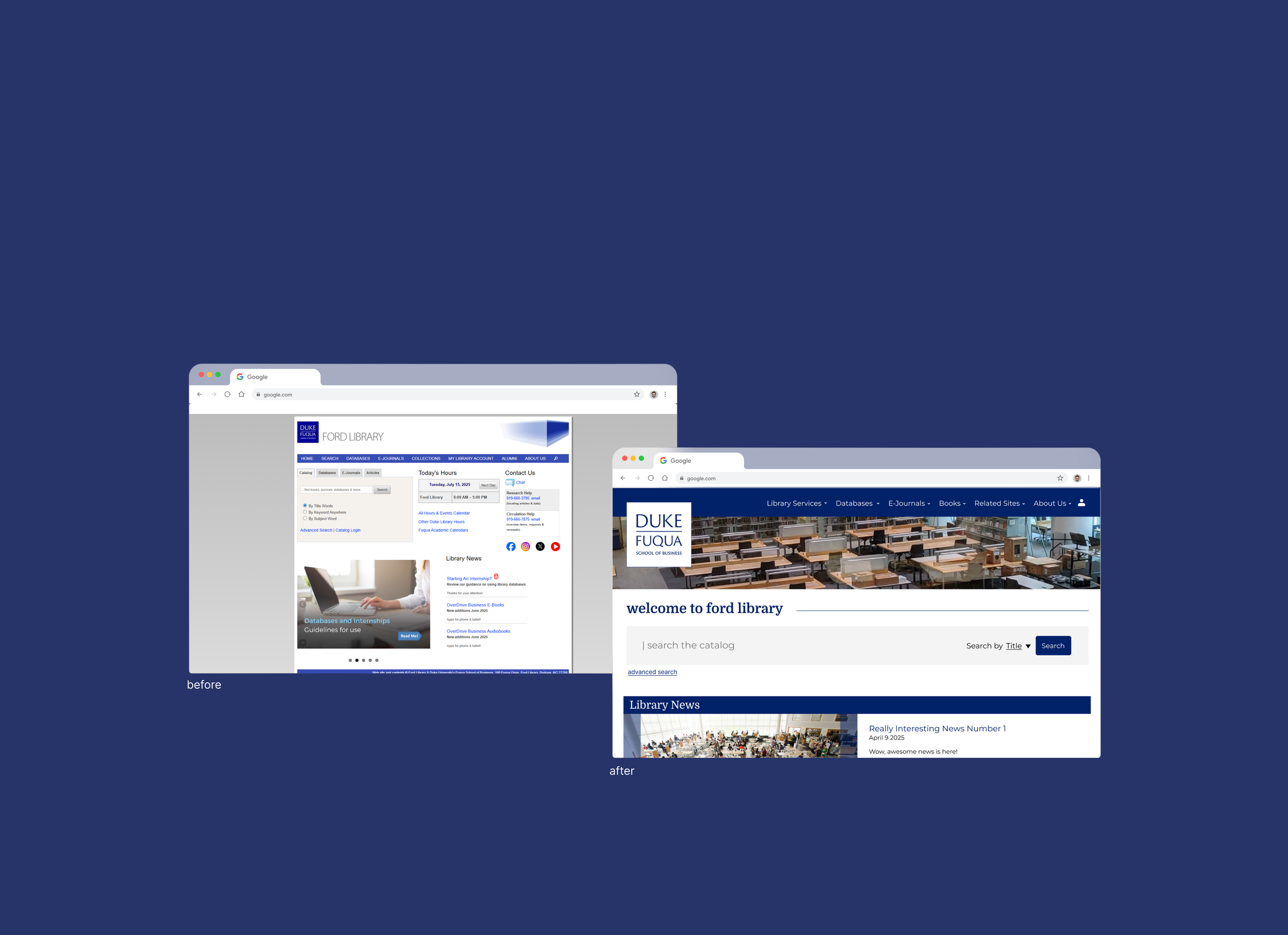
Homepage
Before
outdated design, multiple search pathways, confusing navbar
After
modernized design, streamlined search, intuitive navbar
Databases
Before: A-Z Databases
1 of 2 ways to search for databases, which confused users
Before: Subject Databases
another way to search for databases, inconsistent categorization between the two databases
After
aspects of both databases combined into one - users can filter by subject and by letter. they also have descriptions of the databases as well. one streamlined way to search for databases removes potential inconsistencies
Career Tools
Before
confusing labels, unclear categories
After
clearer categorization, labels with more context


5. VALIDATING OUR DESIGNS
To see how our redesigns performed, we asked the original participants to walk through the updated designs asynchronously and rate their experience using the same SUS scale.
We were pleased to see that the ratings improved, suggesting that our redesign made a real difference in how users experienced the system. Participants reported that tasks felt smoother and navigation was more intuitive, confirming that the changes we implemented addressed many of the frustrations uncovered in the initial testing.
6. PERSONAL REFLECTION
This project reinforced the importance of designing with real users in mind. By observing how students interacted with the Ford Library website and iterating based on their feedback, we were able to make navigation more intuitive and resources easier to find. Through iterative testing, we found that the improvements weren’t just visual, but that they directly enhanced the user experience, helping students accomplish tasks more efficiently and confidently.
User-Centered Impact
Collaboration & Stakeholder Communication
Working on this redesign required close collaboration with our client. Balancing their needs with user feedback taught me how to communicate design decisions effectively and find solutions that met both user goals and institutional requirements. The experience strengthened my ability to advocate for users while navigating real-world constraints